That title doesn't quite get my point across but, if you watch the replay of Therese Calvird's [Lost in Paper] LIVE crafty session HERE it will become clear to you!
I had such a fun time this morning CASE-ing Therese's card. Someone told me recently that when CASE-ing a design, at least *THREE things should be adjusted to make the design your own - thanks, Jen. T!
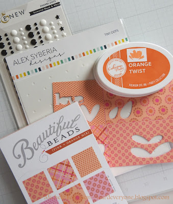
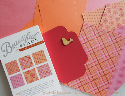
Ready? It all started with choosing my papers:
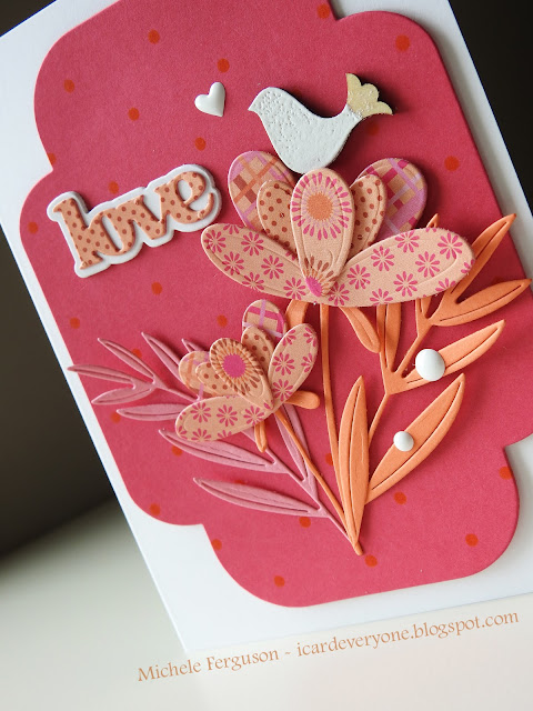
*Where Therese used solid paper mixed with plaid paper for her flowers - I went with ALL patterned. Since this paper from PTI is very thin, I first adhered four of them to a panel using a double-sided adhesive sheet.
*I didn't use any aqua or green - instead using solid pink and orange for the stems, leaves, and ferns!
*Therese did some very subtle stenciling on her base panel - I did too but went with dots instead of stripes! Orange ink on this bright pink certainly kept it subtle. SO subtle that I feel a closeup is a good place to start...


13 comments:
Oh boy... this is a whole lot of CUTE!! Right down to that sweet little bird and, of course, the polka dot love!!
FUN and flirty! Ok.. I don't know so much about the fun but it sure looks whimsical, Michele. How you pop together so many patterns is beyond me, even if they do come from the same pad -- perfect and a great CASE indeed.
Wow, this looks fantastic, Michele. I hadn't heard of the "rule" that 3 things should be tweaked in a case. You followed that very well from your notes. Love the peachy colors and the end result! Thanks so much for sharing. :)
What a pretty color combo! I love the mix of all those patterns and your beautiful design, Michele.
Oh my goodness, talk about pulling things out from the stash. I have those PTI paper pads. What a fabulous way to use them. A,, the detail down to hearts, dots and is that white heat embossing on that sweet birdie?? Awesomw creation.
Stunning, love the colours and those little flower dies. I will put watching Therese's video on my to do list this weekend - hope I get to it! I thought I would keep up with my commenting while I was away this week, but I found that I was just too tired by the time the evening came so gave myself a break xx
I'm having a hard time keeping up with you girlfriend...you are just going to town lately and every card is FABULOUS! I just love pink and orange together and polka dots too! I had forgotten all about this paper pad from PTI and I'm pretty sure I have it somewhere! Beautiful card and beautiful design...love it!! Hugs. :0)
Absolutely adorable! Love the colors your chose.
Such pretty flowers and a delightful little bird! Love that little heart too!
Those whimsical flowers are great in the patterned paper, Michele, and who doesn't love to pop a bird on their card.
What a sweet adorable card. Love your changes.
Well, I certainly have no clue about the rules of CASEing a card! Nothing new there. I've always just made it the same but with my own supplies. Guessing that isn't good! LOL But I'm always bad, so....I love your card Michele, although I haven't seen Therese's, I know that yours is gorgeous. I love that you used pattern papers, they look amazing together and make this card so interesting. A beautiful base you have built this lovely bouquet on as well. The addition of the bird is perfect as are the enamel dots in white. They both pop off these beautiful colors! Hugs, Brenda
AND in orange and pink, I am sure that design paper was made for me lol. I adore everything about this Michele, including that sweet bird, but mostly the time that you used in your day to create a card inspired from my Live, that makes it all the more special! Love you!
Post a Comment