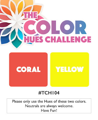
When those wonderful Tulips in Bloom arrived from Penny Black on Saturday, I knew just where I'd be on Sunday, and I'm very happy to share the results with you here between loads on Monday!! Color Hues #104 and my friend Bonnie's color choices may have inspired my own choices: abandoned coral and fossilized amber from my new palette of reinkers!
It was love at first sight but then there was the color decision
for the stems and leaves - green is NOT a neutral [ask me how I know].
A bit of black soot and pumice stone were used to watercolor
all the 'green' bits... you'll see those soon, promise!
A wonderful sentiment from the set was cut using my old faithful
PFS essential labels, I embossed the bottom half of my cover
panel with PB's Linked EF, and planted my tulips over top
of the largest of the PB Classy Frames dies. A smattering of tiny
pearls seemed just the finishing touch I was looking for!
There you have it! Now back to the regularly scheduled Monday loads of fun!
=] Michele


Great card !!!!
ReplyDeletegroeten Ineke
Beautiful tulips. Stunning flowers Michele 🌷I love the Penny Black stamps .
ReplyDeleteLeaf color is always a dilemma when doing florals for a color challenge and you handled it beautifully, Michele. Your tulips are lovely and must have arrived in record time.
ReplyDeleteI know, I know... but green should be a neutral lol. These beautiful blooms certainly do not suffer without the green, you nailed it Michele!
ReplyDeleteJust lovely. I knew we would see those tulips on hear sooner or later. Sooner is always good xx
ReplyDeleteSo pretty. Love the colors of the tulips and that frame die.
ReplyDeletePerfection!!! The tulips, the frame, the sentiment--all creating a beautiful card! Thanks for sharing with us at Color Hues!
ReplyDeleteBeautiful tulips and a wonderful sentiment to boot! Love these!
ReplyDeleteI just knew you'd do great things with those Tulips Michele, and the color combination is absolutely perfect for them! Lovely, lovely card my friend and thanks so much for sharing it with us at Color Hues!! Hugs. :0)
ReplyDeleteWhen I saw those tulips, I knew they would be coming home to live with you! Pretty card, Michele!
ReplyDeleteFantastic! Love all the elements, and I LOVE the colors, especially with your neutrals - kudos, Michele!
ReplyDeleteOh so beautiful, Michele. Would never have guessed the colors you used for the leaves. Wow!
ReplyDeleteThis is a jaw dropper, my friend! The shades of coral and yellow are paired perfectly and look so pretty with the classy frame and embossed background! Thank you for sharing the beauty with us at Color Hues and for pushing me over the edge to order these tulips!
ReplyDeleteOh those tulips knew when to arrive and your reinkers just knew they'd be adding color to them! And your neutral leaves are the perfect shade. Again, Jill would be so proud to see this framed beauty!
ReplyDeleteOh, my goodness, I think this is the one most perfect arrangement for these tulips. I mean, drop the mike... or paintbrush, or whatever. This is utter perfection! Beautiful watercoloring, and those leaves are just fine by me. I haven't ordered mine yet, but you know I will. Did you get the whole kit?
ReplyDeleteMichelle your tulips are so beautiful in the chaklenge colours! Gorgeous actually1 Thank you so much for sharing with us at the Color Hues!
ReplyDeleteI'm back again as I just noticed how the leaves form a heart! An added bonus, my friend!
ReplyDeleteYour watercoloring is beautiful and I love the color of your leaves. Gorgeous card my friend. Thanks for playing with Color Hues!
ReplyDeleteI loved this at first sight, and the first thing I noticed is that the middle leaves form a heart. I am so in love with that frame die and it's just a matter of time before I break down and buy it. Love your neutral solution for the leaves and the bit of embossing on the bottom. A wonderful composition, indeed.
ReplyDeleteSo is black/pumice the new green? lol. You chose perfectly for the stems and leaves for those springy tulips. Someone needs to make a green/grey or green/brown ink and call them neutrals, just sayin. That would solve the problem don't you think?
ReplyDeleteThis is simply beautiful, my friend.
ReplyDeleteIt is always nice having you start off the gallery with such a gorgeous card, Michele. The sentiment is such a good reminder right now. Thanks for playing at Color Hues.
ReplyDeleteI love how you have laid this all out - it's amazing!!
ReplyDeleteBeautiful! Love the fabulous CAS design and the texture you added to make the colors pop! Thank you so much for playing along with us over at the Color Hues Challenge!
ReplyDelete