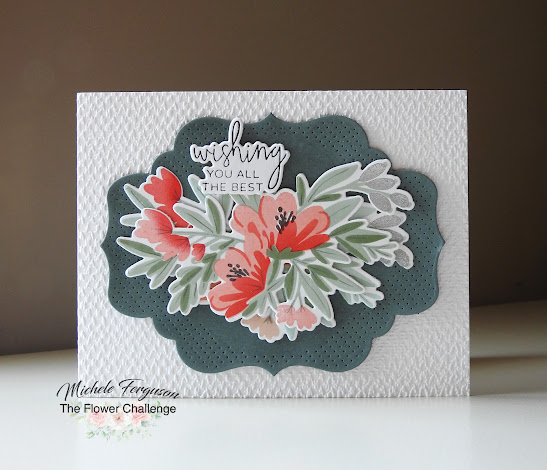
My fellow TFC teammates and I are back with lots more inspiration as a reminder that you still have lots of time to COLOR those florals for our challenge this month!
This time I have concentrated on the first few colors in our inspiration photo:
I found them in these inks:
Thank you, Marcia, for the Floral Delicacy hand-me-down from The Greetery!
I used its layering stencils to make two of the clusters then
stacked them together for a 'fuller' look. BTW if you own this set and are
wondering where those 'lines' came from - the end of my fine line marker!
My card base got its texture from SU's Tasteful Texture.
The green panel is one of the dies from PTI's Love to Layer: Delightful Brackets.
There's one of those fun Betterpress-ed sentiments again!
Did you catch how I sneaked that grey in there?
Okay, now we're passing the 'ball' to you - there's always room for seconds in The Flower Challenge gallery!
=] Michele


so beautiful mf.
ReplyDeletex Karen
Layers of loveliness, my friend and I do spot the gray!
ReplyDeleteI am sorry that I have been missing for a while. I took the grandkids away for a few days and I just can't seem to catch up with myself since. The days keep disappearing and I still haven't done everything. I am so happy to make it here now to see this fabulous flower spray. You have used those colours brilliantly. I am sure that's because they include grey. The peachy reds really pop on that dark frame and the embossed background add texture and interest xx
ReplyDeleteI completely forgot about this set Michele, but so glad you brought it to life with this BEAUTIFUL card! And I love the fine lines you added too...the perfect finishing touch!! Well that and the textured background of course...don't think I'll ever get tired of that look!! Lovely, lovely card my friend!! Hugs. :0)
ReplyDeleteBeautiful, Michele! Love the texture, those yummy colors, the pretty bouquet and that fabulous tag/label die!
ReplyDeleteSuch a beautiful bouquet sure to delight any recipient. I so admire your attention to detail, including adding fine lines and your beloved touch of grey.
ReplyDeleteSo pretty, Michele! Love the textures you've used, and this lovely color palette.
ReplyDeleteA gorgeous bouquet of flowers, Michele! The added detail makes a big difference and it all fits so prettily on the label!
ReplyDeleteThis is so pretty with that pop of red/oranges with that lovely green background and leaves.
ReplyDeleteLovely use of the color board, Michele.
ReplyDeleteWhat wonderful layers and textures, Michele.
ReplyDeleteBeautiful card Michele!! xx
ReplyDeleteDoubling up the flowers created such a full and beautiful bouquet, Michele! It fits perfectly on the bracket die cut too. Love all the texture and that BP sentiment, they're so handy aren't they?
ReplyDelete